Swiss Sense
In-Store Experience

Objective
Rethinking Retail
Swiss Sense is a home design retailer with more than 90 stores in the Netherlands, Belgium and Germany. They wanted to see how digital could modernize the customer experience in and out of the stores. Our goals were to reduce their store footprint, improve the customer experience, and support their salespeople. We created 3 integrated products that would increase engagement and reduce friction all along the various paths throughout the customer lifetime.
Swiss Sense is a home design retailer with more than 90 stores in the Netherlands, Belgium and Germany. They wanted to see how digital could modernize the customer experience in and out of the stores. Our goals were to reduce their store footprint, improve the customer experience, and support their salespeople. We created 3 integrated products that would increase engagement and reduce friction all along the various paths throughout the customer lifetime.
Swiss Sense is a home design retailer with more than 90 stores in the Netherlands, Belgium and Germany. They wanted to see how digital could modernize the customer experience in and out of the stores. Our goals were to reduce their store footprint, improve the customer experience, and support their salespeople. We created 3 integrated products that would increase engagement and reduce friction all along the various paths throughout the customer lifetime.
Swiss Sense is a home design retailer with more than 90 stores in the Netherlands, Belgium and Germany. They wanted to see how digital could modernize the customer experience in and out of the stores. Our goals were to reduce their store footprint, improve the customer experience, and support their salespeople. We created 3 integrated products that would increase engagement and reduce friction all along the various paths throughout the customer lifetime.
Swiss Sense is a home design retailer with more than 90 stores in the Netherlands, Belgium and Germany. They wanted to see how digital could modernize the customer experience in and out of the stores. Our goals were to reduce their store footprint, improve the customer experience, and support their salespeople. We created 3 integrated products that would increase engagement and reduce friction all along the various paths throughout the customer lifetime.
Strategy
Going Deep with the Brand
During our research and discovery phase, we visited stores, interviewed customers, salespeople and key stakeholders. We found customers were overwhelmed by navigating the large stores and amount of options in the highly customizable products. Salespeople often spent over an hour with each customer. The nature of the types of purchases and color options made it difficult for customers to visualize the final product, causing friction in making the purchase.
During our research and discovery phase, we visited stores, interviewed customers, salespeople and key stakeholders. We found customers were overwhelmed by navigating the large stores and amount of options in the highly customizable products. Salespeople often spent over an hour with each customer. The nature of the types of purchases and color options made it difficult for customers to visualize the final product, causing friction in making the purchase.
During our research and discovery phase, we visited stores, interviewed customers, salespeople and key stakeholders. We found customers were overwhelmed by navigating the large stores and amount of options in the highly customizable products. Salespeople often spent over an hour with each customer. The nature of the types of purchases and color options made it difficult for customers to visualize the final product, causing friction in making the purchase.
During our research and discovery phase, we visited stores, interviewed customers, salespeople and key stakeholders. We found customers were overwhelmed by navigating the large stores and amount of options in the highly customizable products. Salespeople often spent over an hour with each customer. The nature of the types of purchases and color options made it difficult for customers to visualize the final product, causing friction in making the purchase.
During our research and discovery phase, we visited stores, interviewed customers, salespeople and key stakeholders. We found customers were overwhelmed by navigating the large stores and amount of options in the highly customizeable products. Salespeople often spent over an hour with each customer. The nature of the types of purchases and color options made it difficult for customers to visualize the final product, causing friction in making the purchase.
Solution
Design is Digital, Comfort is Physical
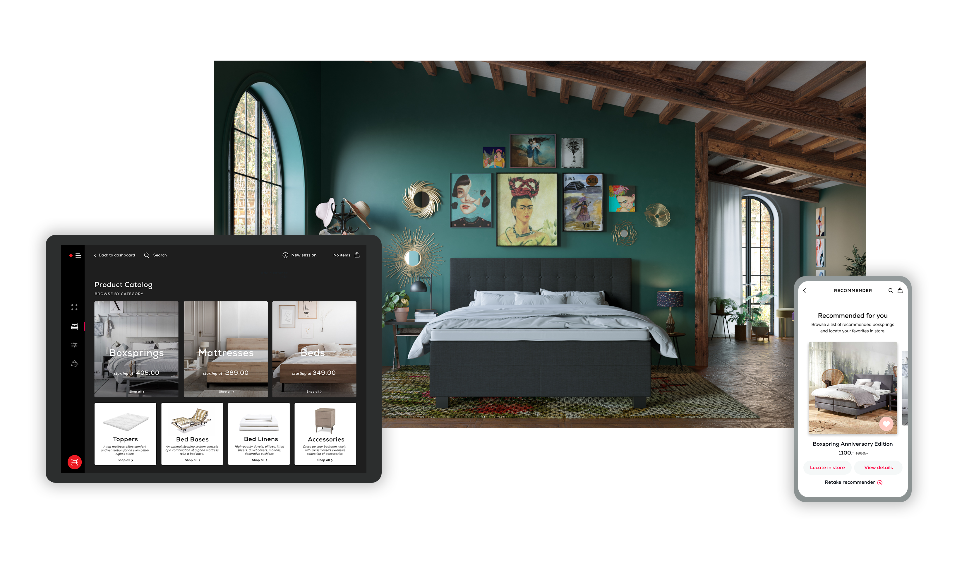
We created 3 key products to improve the customer experience. All 3 products interact with each other seamlessly, linking the store, the customer and the salesperson.
Inspiration Bar - a large in-store interactive experience to encourage customers to engage with the brand and visualize the color and customizable options. This also allows for a smaller store footprint, reducing the need to show as many variables of each product.
Sleepwalker - a mobile app that has an in-store feature that navigates customers around the store, recommends products, learn more about products with QR codes and includes a product customizer.
Sales Portal - a salesperson tablet app that liberates the salesperson from being at a desk, allows them to walk around the store and start conversations with multiple customers. It reduces customer wait times and streamlines checkout.
We created 3 key products to improve the customer experience. All 3 products interact with each other seamlessly, linking the store, the customer and the salesperson.
Inspiration Bar - a large in-store interactive experience to encourage customers to engage with the brand and visualize the color and customizable options. This also allows for a smaller store footprint, reducing the need to show as many variables of each product.
Sleepwalker - a mobile app that has an in-store feature that navigates customers around the store, recommends products, learn more about products with QR codes and includes a product customizer.
Sales Portal - a salesperson tablet app that liberates the salesperson from being at a desk, and allows them to walk around the store and start conversations with multiple customers. It reduces customer wait times and streamlines checkout.
